Mobile Checkout Optimization
Mobile commerce has turned into much more than just a simple evolution of eCommerce. The entire mobile experience has grown exponentially and became a key element in many different industries and services. Just to name a few, mobile devices these days support money transfers, electronic tickets, boarding passes, mobile banking, contactless payments, location-based services, loyalty cards, coupons, mobile marketing, delivery, and plenty other. Let’s see why mobile checkout optimization is so important.
The statistics for mobile eCommerce are constantly changing and the numbers are impressive:
→ 79% of customers order products using their mobile devices
→ Around 40% of all eCommerce purchases done during the holiday season in 2018 were done on a smartphone
→ 95% of mobile users look up information about a product or a service before they purchase it
→ Mobile sales are expected to make up 44.7% of total US eCommerce sales this year, compared to 39.6% in 2018
→ 35% of US consumers use only their mobile phones to shop online.
While it is clear why Mcommerce is so popular, we should also look into what determines users to abandon a website or buy from it. This is why mobile checkout optimization is important.
What makes users abandon the cart?
⦿ Navigation difficulties
⦿ Concerns about payment security
⦿ The speed of the website is too slow
⦿ The complicated, long checkout process
⦿ No available shipping cost information
⦿ Elements are difficult to tap on
⦿ The checkout progress bar is not visible
⦿ Error messages not visible enough
⦿ Unfocused checkout call-to-action buttons
⦿ The checkout form is too long and there’s too much information required
⦿ The header takes up too much space
Now that you know the reasons why shoppers move away from certain websites, you want to focus on improving the mobile checkout process.
Here is a useful checklist of elements you should consider:
-
Crucial elements should be easy to tap
While on the desktop version of your website users can click anywhere without too much trouble, the way they navigate on mobile is completely different. Most people use their thumb to scroll or tap on sections, so the important elements should be placed in that area where they can easily reach for them. This is where your main CTAs should be placed as well.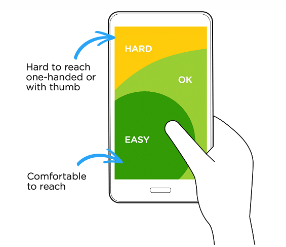
Source: Crazyegg.com
-
Simplify the forms
The first thing to consider is the size of the header. If you use a tall header, you add in the space used for the keyboard, you’re not left with much for the user to work with. So first is first, reduce the size of your header and create more space for the crucial product info and CTAs.
Then you can work on the forms and the input fields. Reduce the number of fields as much as possible, only ask for relevant information on this page. Use full-width input fields so they can be easily tapped with both hands. Include support for auto-fill to minimize text entry. Match the keyboard to the appropriate information requested – for example, numerical keyboard for credit cards and phone numbers. Use the tab index attribute to facilitate skipping from one field to another.
Make sure you are using at least a 16-pixel font size, use a visible asterisk to point out the mandatory fields and show the error messages as soon as the information filled in is the wrong one.
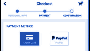
Another thing to consider is the express checkout, such as one-step checkout pages.
-
Add a progress indicator on your checkout
If you are using a multi-step type of checkout, you need to add a progress indicator to the page so the user can have visibility over the process. These progress meters increase customer engagement and they feel good seeing they don’t have a lot left until they finish the buying process.
-
Improve the speed of the website
Users expect websites to load in about 2 seconds. Anything above that is already a lost sale. What can you do to improve the speed?
⦿ Eliminate graphic-intensive elements from the checkout page
⦿ Website graphics should be stored/caches on a CDN (content delivery network)
⦿ Remove social scripts from the checkout
You can test the speed both on mobile and desktop using PageSpeed Insights from Google.
-
Use security badges
Trust seals and SSL seals are very important to the trustworthiness of your website. SSL certificates suggest the technical security of the payment form, whereas the trust seals are a certification of the company itself. A survey performed by Google Consumer Surveys shows which badges give the best sense of trust when paying online. The results are indicated below:
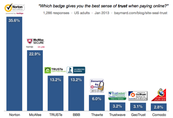
Source: Baymard.com
Let us help you with your mobile checkout optimization! Reach out to us and our experts will be more than happy to guide you in the right direction!