Landing pages that convert are the cornerstone of any eCommerce business, the problem is many fall short of engaging their target audience, fewer still manage to convert visitors to customers.
Businesses around the world shell out millions of dollars each year in driving traffic to their website, in the hope that what people see on arrival will magically win the hearts and minds of prospective customers. Let’s be clear, slapping up a landing page, without considering why or how it might work is ludicrous, hoping won’t get you anywhere, you need a plan.
If in the sad case your landing page fails to entice people down your sales funnel, not only are you missing out on potential revenue as customers take their business elsewhere, but you’re wasting a whole lot of time and money.
If you’re thinking “ahh but how much difference can a landing page make”? The answer is a lot!
Reports on conversion rates show that a measly 1% of companies were “very satisfied” with their current conversion rate and 22% were “quite satisfied” with the conversion rate.
What is a good conversion rate for landing pages? The average landing page rate is just 2.35%, but with many top companies pushing 12%, you have to consider that competitors could well be converting 3 to 5 times the amount you are! Not great if your marketing budget is along the same lines.
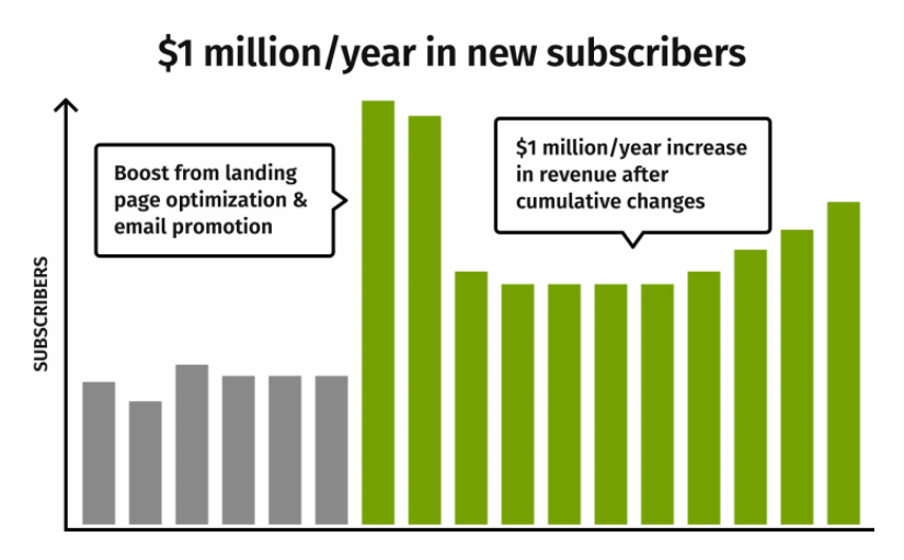
And what happens once you do have a decent well thought out landing page? Take Moz for example, after using a landing page optimization, alongside email marketing and an enticing call to action they generated an extra $1,000,000. Not bad for a landing page.
So let’s dive straight in, and get to the what, the how, and the why behind making a landing page that works.
In this blog we’ll look at:
- What are landing pages?
- 9 Steps To a Successful Page
- Extra Tips That Matter
- Summing Up
What is a Landing page?
Let’s start by defining what the purpose of a landing page is. Conversion is the name of the game, a quality landing will help your business reach your marketing and business growth goals. A landing page can be your homepage, another page within your site, or alternatively, it can be a standalone page created for a specific campaign, product, or sale.
When it comes to homepage vs landing page, eCommerce marketers and businesses seem to get a little confused. It really depends on how visitors find your site, and more importantly why the page exists in the first place. Landing pages are often found organically, using keywords and high ranking search results, homepages on the other hand are often found by word of mouth or social media.
Ultimately a landing page is a standalone web page where visitors land after clicking on an email, ad, or search result.
By creating a landing page in response to an advertising or marketing campaign, businesses can capture visitor information in order to develop leads into customers. Because of this aim landing pages are also referred to as the ‘destination page’, ‘lead capture page’, or ‘static page’.
Every Landing Page is Different
Yes everyone wants the holy grail of increasing conversion, however there may be smaller goals you want to achieve that feed into the bigger goal. These smaller goals will change how you approach creating your page- there’s no standard manual on creating the perfect landing page.
Every landing is different, depending on what your wish to achieve your landing page will have a specific; call to action, reader in mind, product or service, and market that you’re aiming at. You need to think about what you want to achieve, and how you’ll achieve it.
Look at The Below Examples of Landing Page Goals
- A landing page inviting sommeliers to take part in an online quiz pairing different wines.
- Another landing page inviting marketers to an upcoming conference in London.
- A third landing page selling cross-trail running shoes to ultramarathon runners.
Page design for each of these landing pages is going to be different from the next. That’s because there’s a huge amount of variation between industry, audience, purpose, intent, focus, niche, cost, value proposition.
There are however common elements that are present in all high converting, successful landing pages. For the rest of this article, we’ll try to elucidate some of the top ideas which will get your landing page working for you, and your business.
But Before You Start
Before you start with your landing page, work out what you what to accomplish. Ask yourself- are you promoting a new product or service? Trying to grow your email list? Promoting an event? Or advertising a discount on a subscription service?
Once you have defined your goal, think about what your message will be. What exactly is the problem you wish to solve? What are you offering to the reader? Make sure whatever you decide to offer has real value, with so much competition out there, knowing what people need and how to provide that is a game-changer. You need to provide a meaningful value proposition.
Following this, you can start a keyword search. What are people typing when they’re searching for solutions to their problems, the problems that your landing page will answer for them?
Once you’ve outlined your goal, message, and keywords, it’s time to start putting your landing page together. All successful landing pages have key elements that increase conversion, so here’s how to create landing pages that convert
-
A Standout Headline
Attention all! Yes, your headline needs to stand out, it needs to capture the attention of passers-by, it’s where it all begins – attention, interest, comprehension.
The words, the font, the message. It’s what motivates a visitor to stay and investigate more into what your business is offering.
It seems quite obvious what the headline needs to do, but if you’re unsure make sure:
- The headline is eye-catchy- whether through; font, size, wording, style.
- It explains what it means to explain, what is the solution you’re providing to the visitor’s problems?
- Short and sweet. Someones just landed at your site, they need to know what’s happening and quickly. You’ve managed to get them to your site, don’t waffle on. Maximum of 20 words, and if you can make it shorter then better.
So we know how to do it, but how does it look in the real world? Check out ApogeeINVENT – a straight-to-the-point headline that solves so many problems, is clear and easy to understand, and delivers the message in a short time.
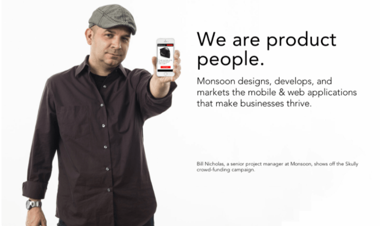
So you want to be catchy, and to the point, disseminating your message accurately. But what if you’ve got a lot to say? Have a look at Monsoons landing page below. Here you can see that there’s a bold stand-out headline, however it doesn’t really tell the reader exactly what the company is offering. When reading the subheading, all becomes clear. Why not make a long headline? The company offers too many services to squeeze it all into one main heading. If this is the case for you, make a catchy headline, and explain more in the subheading.
-
Supportive Subheadings
Following on from the headline, the next element of an effective landing page is the subheading.
Where a HEADING IS THERE TO GET YOUR ATTENTION, a subheading is there to give depth, information, and ultimately interest people enough to stay. Supporting each other they provide the one-two combo which will determine whether your landing page is a winner or a flop.
And what exactly should be included in your subheading?
- Persuasive writing, this is the time to convince your audience you can solve their problems.
- Location- a subheading is normally positioned under the heading, and generally in a smaller size.
- Provide, context, depth, and detail enabling the reader to fully understand what you’re proposing.
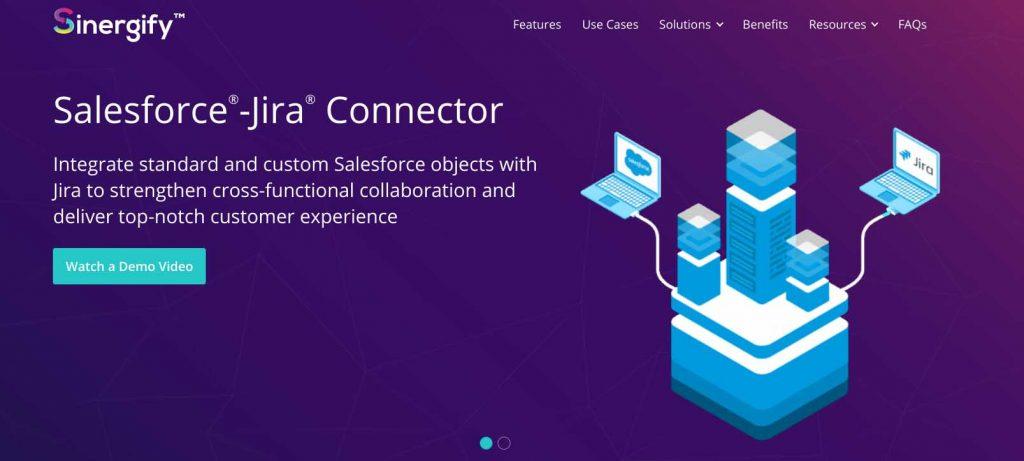
Take a look at the landing page by Sinergify, a clear bright headline to garner attention, followed by straight-to-the-point subheading text which elucidates what the product does ‘strengthen cross-functional collaboration’ and why you should have it ‘top-notch customer experience’.
-
Visual Content
Visual content packs a punch, and is an essential part of any successful landing page.
Your brain likes images more than text, it processes them 60,000 times faster. When you’re trying to get your message across quickly, images can do the job quicker than words.
When you’re selecting images, consider:
- Images need to be relevant to what you’re selling. Use images of your products.
- Make images large and easy to see.
- High-quality images only please- you’re trying to build trust around your products and services nothing does better at turning customers away than poor quality images.
- Color videos have a 36% higher completion rate than black and white.
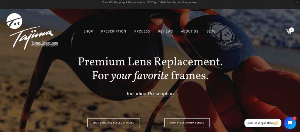
Here we have a great example of product images used on a landing page, with the text overlayed the page enables the visitor to see the product in wide-screen and at the same time the page conveys the brand message in the headline.
Videos
Everyone loves a good video, why? It’s far easier to get a message through a video than text, it’s the difference between trying to extract information from a text and someone standing in front of you explaining why you need it and how it’ll happen. Using videos on your landing page can boost conversions by a staggering 86%.
Videos make it easier for visitors to understand what you’re offering. For all the speed and technological wizardry, the internet can offer, humans like to listen to other humans. Firstly because it’s easier than reading and secondly because humans like to feel connected, connected to other humans. Having some speak to you provides that primordial feeling of connectedness. Images and videos of people have a 66% higher click-through rate (CTR) than those that only contain objects.
-
More Information
It goes without saying, that your landing page needs to tell visitors what you are offering.
Beyond the bold, attention-grabbing headline, and the eye-catchy personable visual content, if your potential customers fail to comprehend what you’re offering, you’ve failed. Clear, no-nonsense writing is needed to highlight the purpose of your work, and what you offer.
Depending on what who the target audience is, and what you’re offering, it might be possible to provide enough information in the headings. Wherever you choose to convey your message make sure:
- You recognize a real problem that the potential customer is currently experiencing
- Provide a clue path for the resolution of this issue.
- Give a value proposition that the customer cannot ignore!
Do think about how the three text elements of your landing page support each other, rather than thinking of them separately see how they work together. And remember images and videos can convey a message quicker than text, so you don’t always have to write wordy explanations.
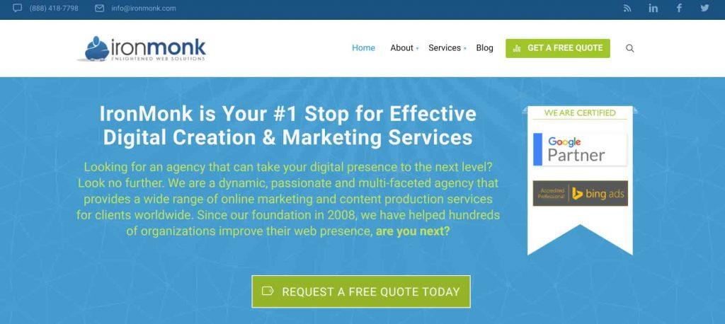
Ironmonk combine a heading, subheadings images all in the same space. They provide a value proposition- free quote, and a clear solution to one of the biggest goals of all online retailers- web presence.
-
Problems
Yes, “Problems” is something that you need to be on your landing page. But why?
What is your business trying to achieve for prospective customers? The answer to this is to alleviate their pain. Humans are hard-wired to avoid pain, problems cause pain and your product or service is there to take that pain away.
By directing a person to think about their pain, they will instantly start to think about how to seek a resolution to their pain, and intern be far more likely to be receptive to your business’s solution.
Ways you can do this:
- Don’t just speak about what a potential customer can gain, talk about what they could lose. Loss aversion is the idea that people are more likely to be motivated to avoid pain rather than experiencing reward. It seems a little bit of pain isn’t such a bad thing.
- Think about how you can use testimonials with references to how your business solved a pain point. This way you’re providing social proof and solution.
If your business solves multiple pain points, why not start off by asking a series of questions to draw out, and identify visitor’s needs.
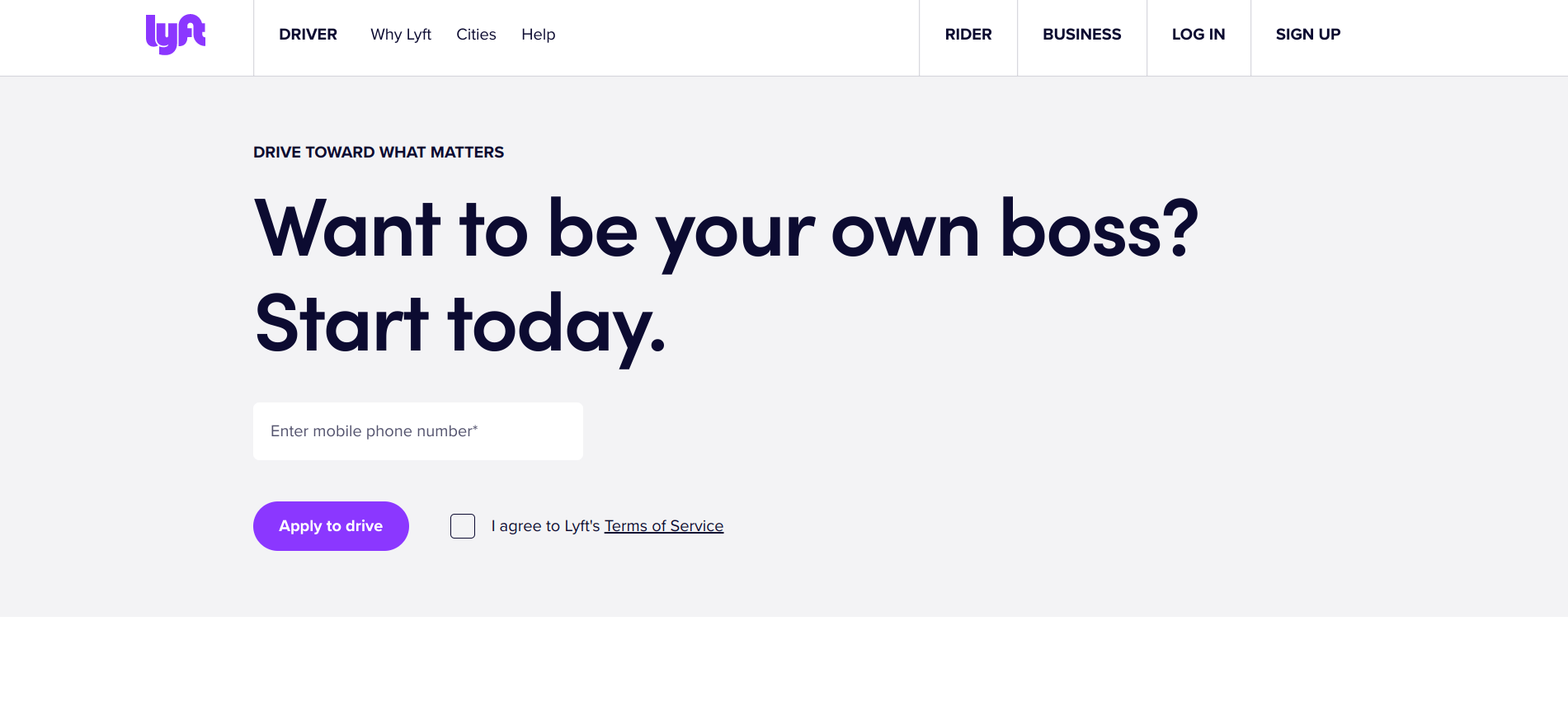
Without getting caught up in too much spiel, Lyft poses a problem/ pain- the idea that you’re currently an employee, and who wants that!? And then the idea of starting today as your own boss. Simple to the point and engages a sense of urgency, and the potential for liberation.
-
Solutions
As much as humans have an inbuilt drive to avoid pain, we very much enjoy pleasure, and nothing elicits pleasure like the answer to a business’s problems.
It’s quite simple really, show how your product or service provides your customers with pleasure, a by-product of purchasing your product.
For example, your business sells outdoor furnaces, yes the primary purpose of the product is to provide warmth, the pleasure bit- allowing you and your family to enjoy precious time, outside, into the long summer nights, in comfort = pleasure. As opposed to sitting in 4 layers of clothing, shivering holding a glass of wine.
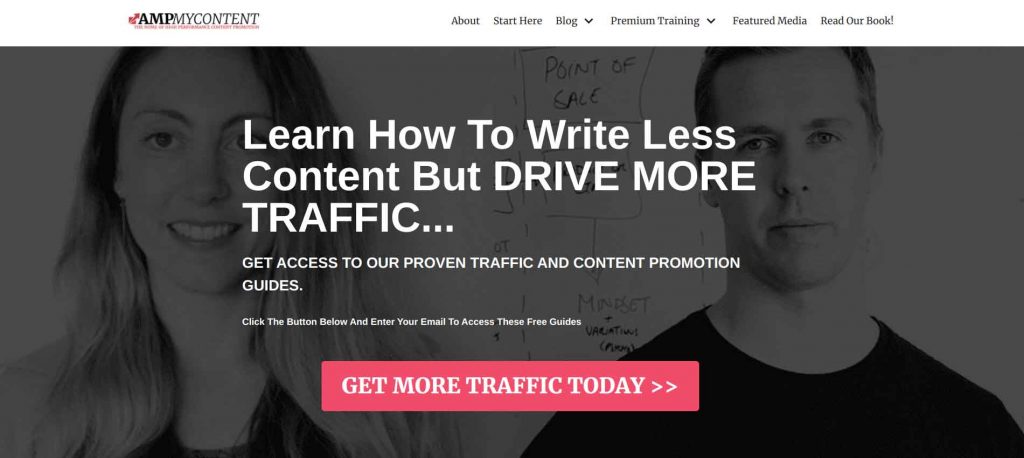
AMPCONTENT shows you exactly where the pleasure is coming from, with clear messaging about how you can remove the pain of writing whilst driving more traffic, sounds perfect!
It’s also important that your landing page offers something. 48% of the top landing pages include more than one offer, however you don’t want to come across as all needy and desperate, as research has shown adding multiple offers to your landing page actually reduces conversion rates by up to 266%.
-
Contact
Ok, you’ve got their attention, appealed to their emotional side, and provided the panacea to their ills, how are they going to contact you?
It sounds like a simple thing, create a form for visitors to fill in with their details, however there’s a right way and a wrong way. First of all, with the increasing distraction provided by online stimuli, you know Instagram, Facebook, and the like the average attention span of homo Erectus is dwindling, currently down to 9 seconds. What does this mean- landing pages need to be easy to use. Endless form fields are not necessary, what is it you need? And what do you not need?
Minimizing landing page form fields to just four boosts conversion by 120%.
Never ask a lady her age, well not at least on a landing page form. Requesting a person’s age can markedly reduce conversion rates too!
Phone Number. Do you need their phone number? Maybe, but could you acquire it through different means, and possibly at a later date, almost certainly. Don’t blow it by being too forward, gently gently now.
Address. Again, do you need their address? You need to build trust with potential customers, not come all weird and a stalkery.
-
Testimonials
Social proof is a big thing. Back in the day word of mouth was how you got to find out where to get the best deals, services, and products. The idea that another human has been there before you and can vouch for a business alleviates anxiety and provides potential customers reassurance that your business is trustworthy and your products worth buying. Using client testimonials is a great way to provide social proof, 82% of customers who have read online reviews say it helps to build trust, which helps to increase conversion.
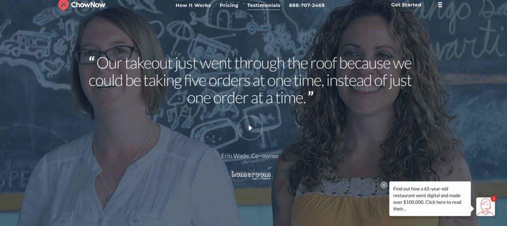
Acknowledging testimonials are one of the best practices for landing pages that convert, ChowNow provides customers testimonials without demoting any other landing page elements.
-
Use a Call to Action
Without a doubt, one of the most important aspects of a successful landing page is the ‘call to action’. 90% of visitors to your landing page will also read your call to action (CTA).
Of all the elements included in the landing page, none is as important as the call to action, it’s the button that all the other elements are trying to steer the visitor towards. The CTA is what converts prospective customers into customers.
When deciding what to do with your CTA do:
- Use a button, they’re tried and tested, and we’ve all become so used to them, you’d be a fool not to use one.
- Color- contrasting colors which help to draw the eye would be helpful, one’s which your company is currently using would be smart, you don’t want to use something new or at odds with everything else.
Extra Tips That Matter
Do Mobile Optimized Landing Pages
It comes as no surprise to anyone that mobile commerce is taking over “Insider Intelligence forecasts that m-commerce will reach $284 billion, or 45% of the total U.S. e-commerce market, by the end of 2020”. And smart businesses know this, 86% of the top landing pages are optimized for mobile. It goes without saying, make sure your landing page is mobile optimized!
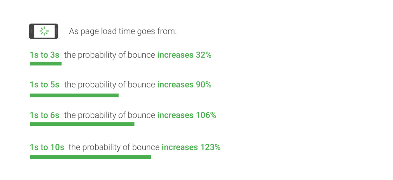
Do make Sure You’re Quick
Ok, it’s one thing wanting quick response times, but it’s another knowing how to achieve it. Some of the keys to improving page load times include:
- Leverage Browser Caching. Browsers cache huge amounts of information (images, stylesheets, JavaScript files) that’s so when a visitor returns to your site the browser doesn’t have to reload the whole page. Set an expiration date for your cache, you don’t need it stored forever, and it’ll speed page load speed.
- Server Response Time. Affected by the number of resources each page uses, traffic levels, software your server uses, and the hosting solution you use. Ake sure your hosting provider is providing you with the performance you need. The optimal server time is under 200 ms.
- Use a Content Distribution Network (CDN). Used to distribute the load of delivering content. Basically, copies of your site are stored at multiple, geographically dispersed data centers so users have faster, more reliable access to your site.
A/B Testing
Test and Retest. Also known as split testing A/B testing is the process of showing two variants of the same web page to different segments of visitors to a website, at the same time comparing which variant elicits the greatest amount of conversions. By using split testing you can see what is or isn’t working on your landing page, giving actionable insights into how you can increase conversions. Some of the key ways A/B testing helps to do this is:
- Solve Visitor Pain Points
- Get Better ROI from Existing Traffic
- Reduce Bounce Rate
When it comes to creating high conversion landing pages A/B testing comes out as the most common method for optimizing landing pages and improving conversions, I mean A/B testing is so successful President Obama used A/B testing to accrue an additional $60 million. Simply it’s a smart idea to see how potential customers use your website.
Summing Up
There we have it, a full-proof guide to setting up a first-class landing page! If you’re one of those people whos skipped to the end what do you need to know?
- Headings- whether it’s your heading or subheading, make it bold, clear and to the point. Provide an answer to your prospective customer’s pain and problems.
- Educate- make sure you explain what you can offer, there’s no point in having catchy headings if you leave the visitor confused.
- Visual content- convey your message through images or videos. You’ll get your point across quickly.
- Testimonials- provide social proof with testimonials to see conversion rates rising.
- Call to action- every landing page needs a call to action, use a button to simplify things.
- Use A/B testing- how do you know what actions you should take, test and retest.
- Mobile optimized- with an increasing amount of business happening on mobile, make sure your landing page is ready.
- Speed- everyone knows the score, slow page speed decreases conversion, ensure your site is speedy.
Creating high conversion landing pages shouldn’t be a drag, with a little bit of knowledge, planning and a decent understanding of your customer’s online retailers can create successful landing pages that convert.
If you want to know more about how your business can benefit from having a quality landing page, get in contact with the Ecomitize team. Our dedicated and highly experienced experts will show you how to create high-converting landing pages to put you ahead of the competition.